SÖRCE
The SÖRCE Design System · V3

The Science Behind the Art of Well-Aging.

A working reference for everyone building SÖRCE artifacts — landing pages, ads, decks, leave-behinds, print pamphlets. The pages, palette, voice, and photography rules that make a thing feel like SÖRCE the moment you see it. Use this guide as canon. The page itself is built in the system it documents.

Brand
SÖRCE Health · Fort Lauderdale physician-led longevity clinic
System Version
V3 · Cream / Champagne / Sage / Coral
Maintained by
Boris with design oversight, Jesse for positioning
01 · Essence

Physician-led. Evidence-anchored. Quietly premium.

SÖRCE sits at the intersection of clinical seriousness and editorial warmth. We are not a medspa, not a hospital, not a wellness influencer. The visual and verbal system has to do that work in every artifact — the moment a prospect lands.

Positioning

Optimal, Not Normal.
Counter-positioning frame. “Normal” population labs and inactivity-sized fitness norms describe sick people getting older. SÖRCE measures and trains for the optimal range — what your engine is actually capable of. Always anchored with audience-voice opener and a piece of proof; never deployed as a standalone tagline.

Voice anchor

Audience-first openers.
Lead with the patient’s desire-language — what they already feel and want. Bridge to the SÖRCE perspective with a calm pivot (“We call that optimal.”) Close with proof. Never open with “SÖRCE believes…” or “At SÖRCE, we…”

Metaphor

The engine reframe.
Dr. Coe’s preferred image: an engine that isn’t running to performance. Use it sparingly — one or two per artifact — to reframe a result-anxiety conversation as a mechanical question: which part isn’t firing, and what would tuning it look like.

Audience

40s–65, Apple Watch dominant.
Prevention-curious, financially capable, but largely uneducated on DEXA, VO2 max, and the science of well-aging. They feel something is off and don’t have language for it. We give them the language and the measurement.

What we are not

Not medspa, not concierge fluff.
No pink-and-gold wellness branding, no “Drip & Glow” menus, no vague hormone optimization promises. The aesthetic is editorial-residential warmth, the data is real, the physician is named.

Sparring posture

Recommend. Don’t decide.
In partner conversations and patient-facing copy alike: present the recommendation with the reasoning underneath, so a partner physician or patient can disagree intelligently. Never paternalistic, never cult.
02 · Wordmark

The mark is the type.

SÖRCE is set in Cormorant Garamond 500, ALL CAPS, with generous tracking. The umlaut over the “O” is load-bearing — never substitute a plain “O.” Compensate the left padding to keep the optical center balanced.

SÖRCE
Small · 22px / 8px tracking
SÖRCE
Medium · 36px / 14px tracking
SÖRCE
Large · 60px / 22px tracking
SÖRCE
The Science Behind the Art of Well-Aging

Wordmark CSS spec

font-family: 'Cormorant Garamond', serif; · font-weight: 500; · text-transform: uppercase; · letter-spacing: 14px; · padding-left: 14px;

The left-padding equals the tracking value — this offsets the optical pull of the trailing letterspace so the wordmark reads centered. Tagline lockup: Inter 600, 9.5px, 3.5px tracking, UPPERCASE, champagne-deep color.

03 · Color

A warm-neutral palette with three accent voices.

Cream is the canvas — never stark white. Champagne signals premium and lives in eyebrows. Sage is the natural-sciences accent — soft callouts, success states, partner sections. Coral carries warmth and emphasis: italic-in-serif headlines, CTAs, ribbon callouts. Dark / ink anchors text and the deepest sections.

Cream & Paper

Cream
Background
#F7F2E8
Primary canvas. Warm-neutral. Never use stark white as page background.
Cream Alt
Background — cooler
#FAF7F2
Section variation when you need a slightly cooler tone next to cream proper.
Paper
Card surface
#FFFFFF
Card backgrounds only. Never page background. Always paired with a 1px border in rgba(22,35,27,0.10).

Champagne

Champagne
Warm surface
#E8DCC4
Secondary section background. Warm sections, premium-tier callouts.
Champagne Deep
Brand accent
#d4b96a
Eyebrow text, premium signal, foil-stamp candidate for print finishes.
Champagne Deep Alt
Text-on-light
#b89a4a
Champagne when it has to read as text on cream — accessibility-friendlier than the brighter variant.
Champagne Soft
Pill background
#e8d9a8
Soft pill / chip background. Pairs with champagne-deep-alt text.

Sage

Sage
Primary accent
#8B9D83
Natural-sciences accent. Section backgrounds, partner sections, science callouts.
Sage Deep
Sage on light
#5e8474
Sage when it must read as text on cream. Success states, eyebrow variant.
Sage Soft
Soft callout
#d4e2dc
Pill background, soft callout boxes, “good example” voice cells.

Coral

Coral
Secondary accent
#D08B7A
Italic-in-serif emphasis in headings. Ribbons. Warm callout color.
Coral Bright
CTA / button
#c4664d
Buttons, primary CTAs, link hovers. Stronger contrast than coral proper.
Coral Deep
Coral on light
#9c4f3a
Coral when it must read as body text or hover state. Deepest accent.
Coral Soft
Pill / warning
#f0d9d0
Soft pill background. Background for “don’t” voice examples.

Dark / Ink

Dark
Primary text / dark surface
#16231b
Headlines and primary text on light. Dark hero / footer sections.
Dark Deep
Deepest dark
#0e1612
Reserved for dark-mode emphasis or print spot-finishes.

Text

Text
Body text
#1a1a1a
Default body text on light backgrounds. Slightly warmer than pure black.
Text Muted
Secondary body
#5a5a5a
Lede text, secondary body, card descriptions.
Text Subtle
Captions / labels
#8a8676
Captions, photo credits, retail strikethrough prices.
Text on Dark
Body on dark
#f0ebe0
Body text in sage / dark sections. Warm cream-tone, never stark white.
Text Dim on Dark
Secondary on dark
#a8b0a4
Secondary body text in sage / dark sections.

Borders

Border
Primary divider
rgba(22,35,27,0.10)
Card borders, section dividers, hairlines under section heads.
Border Soft
Secondary divider
rgba(22,35,27,0.06)
Subtle internal dividers, code-chip borders, list rules.
04 · Typography

Cormorant for the art. Inter for the science.

Two families. Cormorant Garamond carries the editorial voice — headlines, pull-quotes, italic emphasis. Inter does everything else — body, UI, eyebrows, labels, captions. Italic-in-serif coral is the brand’s signature emphasis move.

Cormorant Garamond · Serif

The science behind the art.
Hero · 48–64px
weight 500
italic 500 (coral) for emphasis
letter-spacing -0.02em
line-height 1.04–1.1
A working reference for everyone building SÖRCE artifacts.
Section head · 28–32px
weight 500
letter-spacing -0.015em
Subsection or card title.
Subsection · 22–24px
weight 500
line-height 1.2–1.3
“The engine isn’t running to performance.”
Pull-quote / italic accent
italic 500–600
color: coral or coral-deep

Inter · Sans

A working reference for everyone building SÖRCE artifacts — landing pages, ads, decks, leave-behinds, print pamphlets.
Lede · 17–19px
weight 400
color: text-muted
line-height 1.6
Body copy. The default size for paragraph text on the web. Letter-spacing -0.011em keeps the line tight without feeling cramped. Bold and 600 weights are reserved for genuine emphasis.
Body · 14–15px
weight 400 (500 emphasis)
letter-spacing -0.011em
Caption / photo credit / footnote. Text-subtle color, slightly tighter line-height.
Caption · 12–13px
weight 400
color: text-subtle
Eyebrow · Sectional Label
Eyebrow · 9–11px
weight 600–700
tracking +1.5 to +3px
UPPERCASE
color: champagne-deep-alt (default), sage-deep, or coral-deep

Weights in use

Cormorant Garamond

400 — Regular
500 — Medium (default)
600 — Semibold
700 — Bold
500 italic — emphasis
600 italic — pull-quote

Inter

300 — Light
400 — Regular (body default)
500 — Medium
600 — Semibold (eyebrow)
700 — Bold (eyebrow / pill)
800 — Extrabold (rare)
05 · UI Patterns

The vocabulary of small components.

Eyebrows, pills, ribbons, cards, pricing, watermarks. These are the recurring micro-elements that make any new SÖRCE artifact instantly recognizable.

Eyebrow text

01 · Champagne
Default eyebrow color
02 · Sage
Science / partner sections
03 · Coral
Featured / highlighted
Inter 600/700 · 9–11px · tracking +2.5 to +3.5px · UPPERCASE

Pills / badges

DEXA Included Featured Tier Investigator Use Only VO2 Bundle Limited
Rounded 999px · 5px × 14px padding · Inter 700 · 9.5px · tracking +1.8px · UPPERCASE. Use sage-soft for science/inclusive, coral-soft for featured/limited, champagne-soft for investigator/regulatory labels.

Ribbon (featured-tier card)

Most Booked

Blueprint for Women

DEXA + labs + consult
$649 retail
$399

Pricing display — retail strikethrough always on top

Correct
$649 retail
$399
SÖRCE Blueprint
Anchor on top, discounted price below. Eye reads anchor → savings → offer name.
Never
$399
$649 retail
SÖRCE Blueprint
Inverted order. Reduces perceived savings — the eye reads the discounted price as the anchor.

Card surfaces

Default card

Editorial section card
White paper background, 1px border, 28px padding, 4px radius. Hover translates -2px and adds soft shadow.

Spec

CSS skeleton
background: #fff;
border: 1px solid var(--border);
padding: 28px;
border-radius: 4px;

Clinical-honesty watermarks

Adapted — preclinical data Source-anchored Interim Illustrative Projected
Sage watermarks — data adapted from external sources (cite the source). Trustworthy provenance.
Coral watermarks — SÖRCE-projected, illustrative, or interim data. Reader is cued these are not finalized outcomes.

Sticky topnav

Cream background at 94% opacity with backdrop-blur 8px · 1px bottom border in rgba(22,35,27,0.10) · brand wordmark left, nav links right · nav links in text-muted, hover to coral-deep. See the topbar at the top of this page for the canonical implementation.
06 · Layout

Editorial. Generous. Asymmetric is fine.

SÖRCE is not a corporate-deck brand. The layouts breathe. Whitespace is the design. Asymmetric grids are welcome when they serve the read.

Whitespace
Sections breathe at 96–110px top-bottom padding on desktop, 64px on mobile. Section heads cap at 820px width. Body content caps at 720px for readability.
Hero
Hero sections favor serif italic emphasis in coral on the headline. Lede in 17–19px Inter, text-muted color. Optional 3-column meta strip below the lede with 10px sage-deep eyebrow + 14px body value.
Asymmetry
Two-column hero grids of 1.5fr / 1fr are part of the brand. The wider column carries copy, the narrower carries a hero card or stat tile. Don’t default to symmetric 1/1 when 1.5/1 reads better.
Photo slots
4:5 vertical for portraits and human subjects. 21:9 horizontal for hero bands and atmosphere shots. Photos always live inside a 1px border in rgba(22,35,27,0.10) — never bleed-edge unless print.
Print margins
Letter size, 0.4–0.5in margins. Pamphlets and trifolds use short-edge flip duplex. Photo bleeds need 0.125″ extra. Foil-stamp accents default to champagne-deep.
Section colorways
Cycle cream → cream-alt → champagne → sage → cream → dark through long pages. Champagne and sage break the cream rhythm; dark is reserved for the highest-emphasis moment (final CTA, guardrails).
Avoid
Dense corporate-deck layouts. 3-color gradient headers. Glassmorphism. Neon accents. Full-bleed dark backgrounds for primary content. Anything that feels like a SaaS marketing site.
07 · Photography

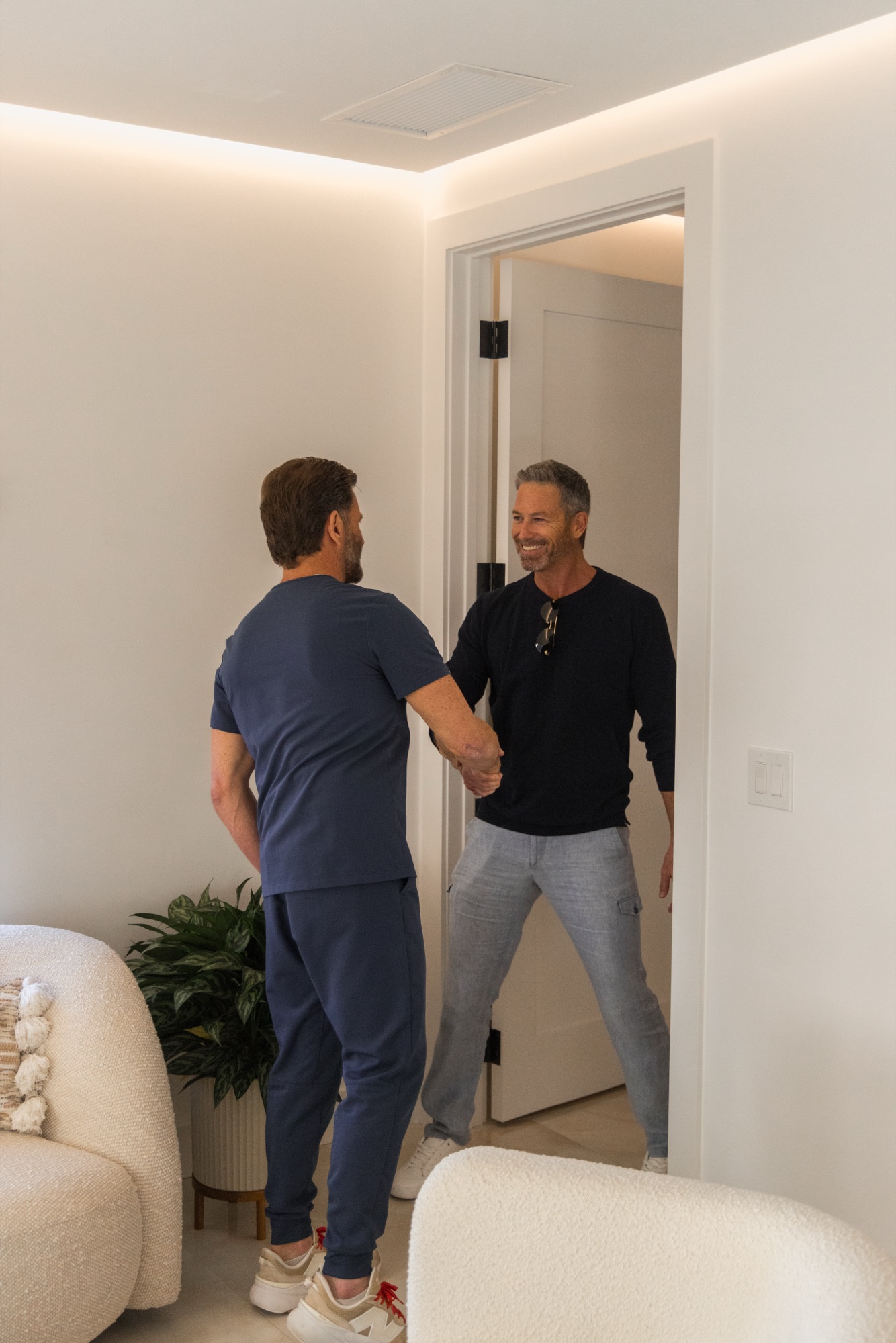
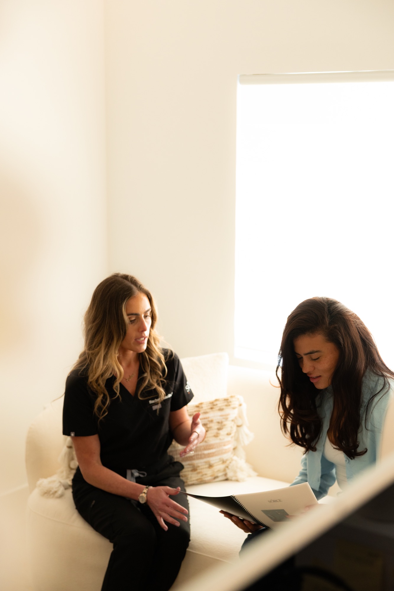
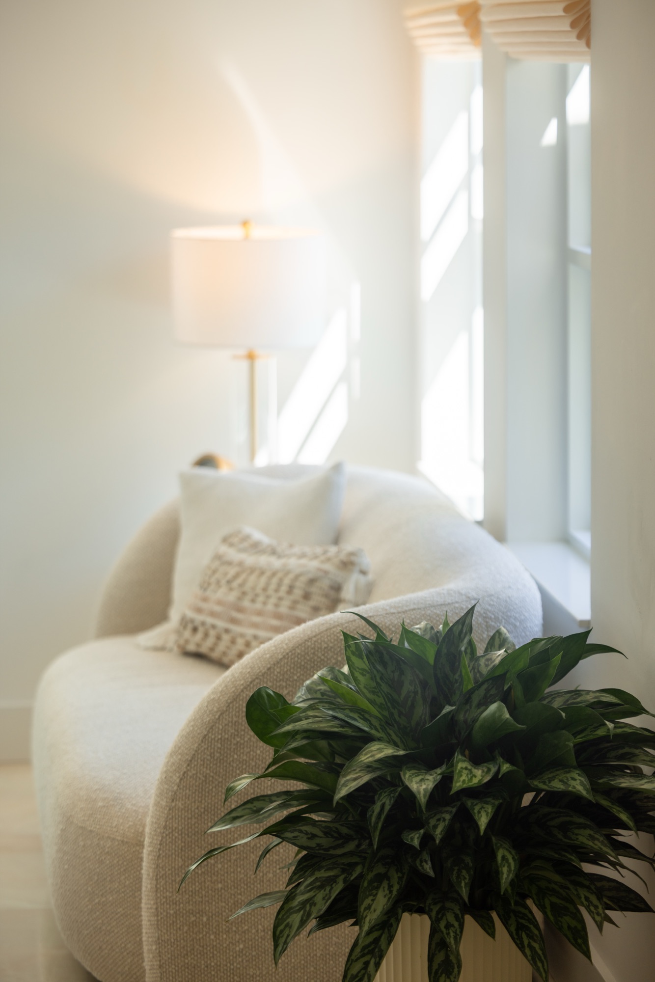
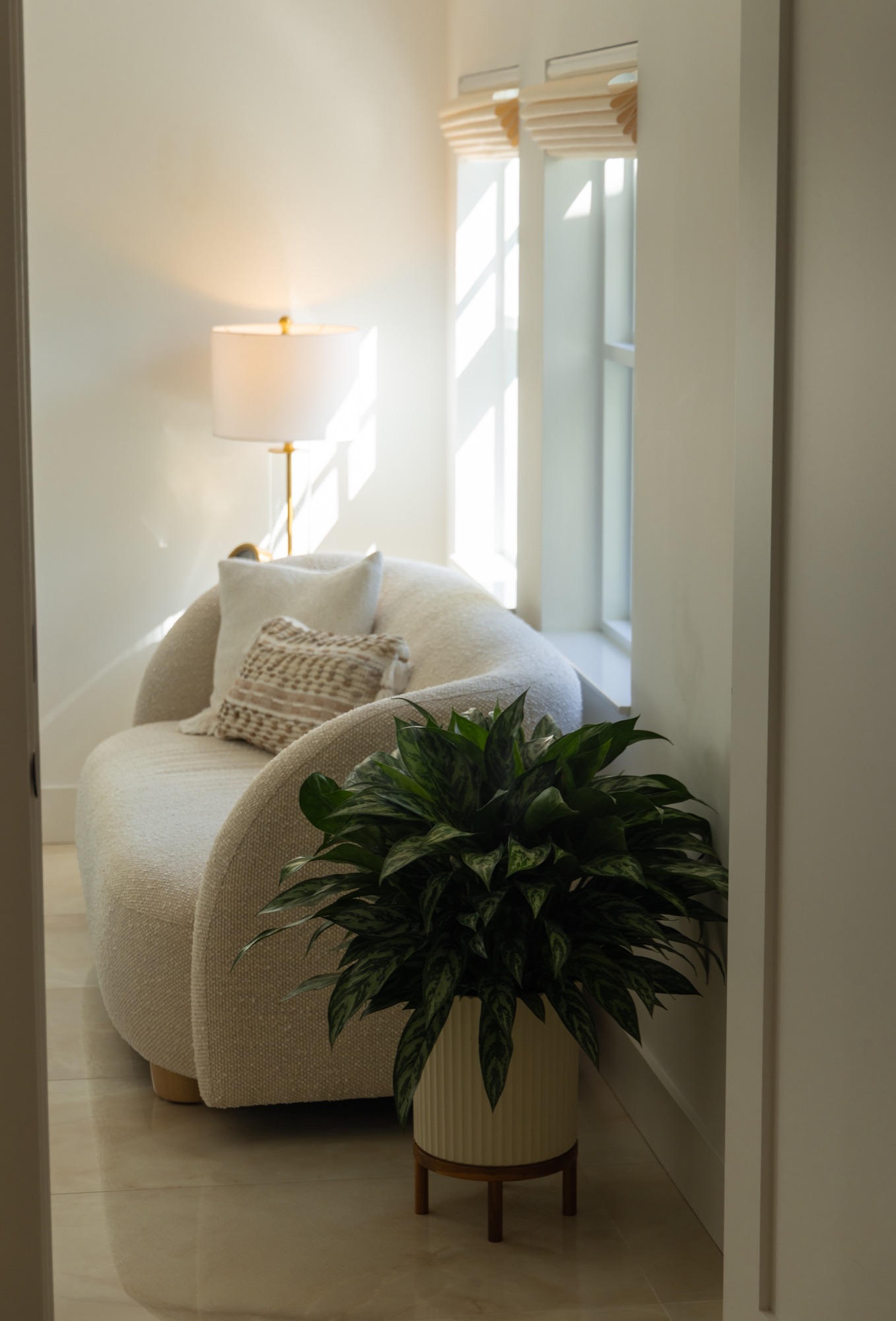
Clinical-residential. Sunlit. Real people.

SÖRCE photography is the brand’s biggest moat against medspa visual sameness. Sunlit interiors, white boucle, plants, warm wood, brass fixtures. Real SÖRCE physicians (Dr. Coe in scrubs, NPs in black) and real patients in the 40s–65 range. Default to the existing photo library before reaching for AI generation.
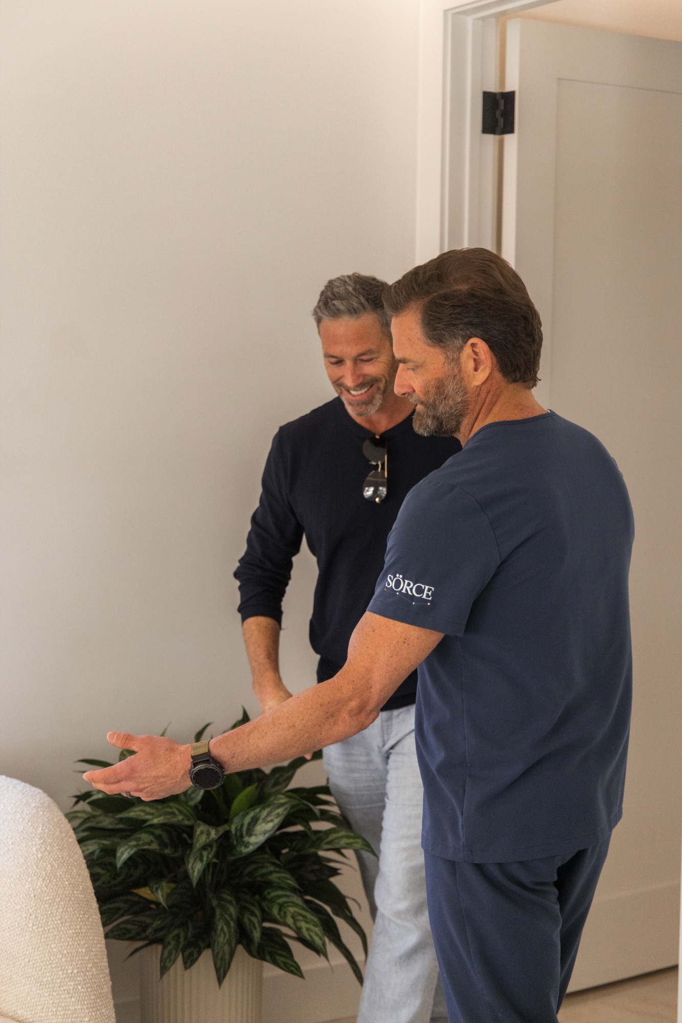
Dr. Coe greeting a patient in a sunlit consult space
Subject · Physician + patient
Real interaction, no posed thumbs-up. Warm wood, candid posture, eye contact between subjects rather than the lens.
Clinician reviewing patient materials in a sunlit space
Subject · Clinical context
Materials in hand, not a lab. Document review and explanation are the brand’s core moment — teach, don’t prescribe.
Patient in recovery, candid smile
Mood · Hopeful, warm
Hope without cheese. Candid smile, natural light, no stock-photo grin. Faces stop scrolls — default to faces in ad creative.
Sunlit atmosphere shot, lamp and warm interior
Atmosphere · Wide hero band
Wide horizontal atmosphere shot. Sunlit interior, residential warmth, brass and wood. This is the brand’s native environment.
White boucle texture, sunlit
Texture · Material library
Boucle, linen, raw wood, ceramic. Texture shots fill space when human subjects aren’t available — never replace humans on hero.
Dr. Coe in consult, warm scrubs
Subject · Physician portrait
Named physician in scrubs. Eye contact OK here — patient-facing trust shot. Warm grading, never blue-cool clinical.

Direction notes

Settings: sunlit interiors, white boucle, plants, warm wood, brass fixtures. Never fluorescent-lit medical exam rooms.

Subjects: real SÖRCE physicians (Dr. Coe in scrubs, NPs in black) and real patients in the 40s–65 demographic.

Mood: warm, hopeful, candid. Avoid stock-photo grins or staged thumbs-up energy.

Composition: generous negative space, sun-flare welcome, asymmetric framing OK.

Color: untreated to lightly graded — keep skin tones warm and natural. Never apply heavy color grading or filters that break the V3 palette.

Avoid: stock medical photography, syringe close-ups, lab-coat formality, harsh white backgrounds, blue-tinted “hospital” light.

08 · Voice

Audience-first. Always.

The single most-broken rule in SÖRCE drafts is opening with our perspective instead of the patient’s. The fix is mechanical: lead with their desire-language, bridge to ours.

The audience-first opener pattern

Don’t open with us
“At SÖRCE, we believe in optimal — not just normal — aging.”
SÖRCE-first. Patient hasn’t entered the sentence yet. Reads like an internal value statement.
Lead with their feeling
“You’re working out, eating clean, sleeping — and still feel a step behind. Your labs come back ‘normal.’ We call that optimal-not-found.
Audience desire-language opener. Calm pivot to SÖRCE perspective. The frame lands because the patient is already in it.
Don’t promise outcomes
“Recover 30% faster after surgery with SÖRCE’s Recovery Pack.”
Outcome promise without trial data. Healthcare-marketing-claim violation. Gets you sued and breaks trust.
Frame as observation / capability
“An early Big Joe note: five weeks to lifting post-surgery. The Recovery Pack is the protocol behind that.”
Patient-consented phrase. Framed as “early observation,” not promise. Protocol > outcome.
Don’t use Optimal Not Normal as a tagline
“Optimal, Not Normal.”
— (no setup, no proof)
Floats without context. Reads like wellness-influencer copy. ONN must always have an audience opener and a piece of proof around it.
ONN with full context
“Your bloodwork came back ‘normal.’ That word describes the average sick population getting older. Optimal is what your engine is actually capable of — and we measure it.”
Audience-voice setup → counter-positioning → capability proof. The full ONN move.

Copy rules in one paragraph

Plain language over jargon. Sparring over nodding — recommend with reasoning, don’t decide for the reader. Recommendation + Why + How-to-apply structure for any guidance copy. First-principles framing where possible — show the underlying mechanic, not the buzzword. Italic-in-serif coral for the one or two words that carry the emphasis. Use the engine metaphor sparingly — one or two per artifact, not as a constant refrain.

09 · Healthcare Guardrails

The non-negotiables.

SÖRCE is a physician-led healthcare brand. The marketing copy is regulated speech. The rules below are not stylistic preferences — they are legal and ethical floor.

Non-Negotiable

If a draft violates one of these, it does not ship.

  • No fabricated patient testimonials. The only consented patient phrase in current rotation is Big Joe’s “5 weeks to lifting post-surgery.” Frame it as an “early patient observation,” not a guaranteed result. Any new testimonial requires explicit written consent on file.
  • No outcome promises. Never “you will recover X% faster,” “guaranteed lower biological age,” or any percentage / timeframe claim absent peer-reviewed trial data and FDA-compliant disclosure language.
  • No implied endorsements. Don’t imply a physician approved copy you wrote. If you’re uncertain, frame as “draft for investigator review” or “pending Dr. Coe’s sign-off.”
  • Investigator / study artifacts must include sponsor disclosure. Anything labeled “trial,” “investigator,” or “study” must carry sponsor disclosure language and an “investigator use only” mark where applicable.
  • Watermark all illustrative or projected data. Use the Interim, Illustrative, Projected, or Adapted watermark chips. The reader must always know whether a number is observed, projected, or adapted from external sources.
  • No multi-testimonial walls of fabricated quotes. One real, consented patient observation beats five plausibly-worded fakes. The audit trail matters more than the social proof density.
  • Compounded / off-label products require physician-led framing. Never market a compounded peptide or off-label use as a consumer product. Always frame as a physician-prescribed protocol.
  • When in doubt, route through Dr. Coe or Greg. If a copy claim feels close to the line, it probably is. Pause and route — the cost of pausing is hours; the cost of shipping a bad claim is the brand.
10 · Print

Letter-size, generous margins, foil-friendly.

SÖRCE prints well because the digital system was built with print in mind. Letter is the default. Pamphlets and trifolds short-edge flip duplex. Foil-stamp accents default to champagne-deep.

Page setup

Letter, 0.4–0.5in margins
@page { size: letter; margin: 0.5in; }

Always include an @media print block that strips digital chrome (sticky topnav, hover states, dark sections that don’t print well) and switches dark backgrounds to white.

Bleeds

0.125″ for photo edges
Photo bleeds add 0.125″ on each bleeding edge. Center-crop the subject inside the safe area. Don’t place the wordmark or critical text inside the bleed zone.

Trifolds

Short-edge flip duplex
Pamphlets fold short-edge. Panel widths must account for the inside fold being slightly narrower than the outer panels.

Finishes

Foil & spot
Champagne-deep is the natural foil-stamp accent. Spot UV on coral italic emphasis. Uncoated stock matches the editorial tone better than gloss.

Stock

Cream uncoated, 100lb+
Uncoated cream paper at 100lb+ matches the on-screen feel. Avoid gloss stocks — they read medspa, not editorial.

Watermarks survive print

Stay legible at 300dpi
When printing illustrative or projected data, the watermark chip must remain legible at 300dpi. Don’t shrink it below 8pt in print.
11 · The Do-Not Gallery

Things that break the system.

If you see one of these in a draft, route it back. Each of these has been a real failure mode somewhere in the SÖRCE history.

Visual
Medspa pink and gold
Hot pink, rose gold, “Drip & Glow” gradients. We are clinical-editorial, not wellness-influencer. The palette is cream / champagne / sage / coral — never pink.
Photography
Stock medical photography
Blue-lit lab coats. Stethoscope-on-keyboard. Smiling-doctor-pointing-at-tablet. Use real SÖRCE photos or warm Higgsfield generations — never iStock medical.
Photography
Syringe close-ups
Triggers medical anxiety, fails ad-platform review, breaks the warm clinical-residential tone. Show the conversation, not the needle.
Voice
“SÖRCE believes…” openers
SÖRCE-first violates the audience-first rule. Lead with patient desire-language; bridge to our perspective with a calm pivot.
Voice
Outcome promises
“30% faster recovery,” “guaranteed lower biological age,” any percentage absent trial data. Frame as observation, capability, or protocol — not result.
Voice
Optimal Not Normal as standalone tagline
ONN floating without setup or proof reads like influencer copy. Always anchor it: audience opener → ONN frame → piece of proof.
Trust
Multi-testimonial walls of fabricated quotes
Five plausibly-worded fakes < one real consented patient observation. The audit trail matters more than the density.
Trust
Implied physician endorsement
Don’t imply a physician approved copy you wrote. Frame as “draft for investigator review” if uncertain. Real attribution requires a real sign-off.
Layout
Dense corporate-deck slides
12-bullet KPI tables. 4-quadrant matrices with no breathing room. SÖRCE is editorial — if it looks like a McKinsey deck, it’s wrong.
Pricing
Discounted price above retail strikethrough
Always: anchor on top, discounted price below. Inverting reduces perceived savings and weakens the offer.
Type
Replacing “Ö” with “O”
The umlaut is load-bearing. SORCE without the diacritic is a different brand. Always SÖRCE.
Type
Substituting Cormorant or Inter
Don’t default to Playfair, Lora, or system serifs. Don’t default to Helvetica or system sans. The pairing is part of the system.